Last May, in conjunction with the release of our app’s new user interface, we rebranded and updated our marketing website design. The results have been phenomenal with a 31% increase in conversion rate.
Want to know how we did it? Let me share.
Building a Website Design Strategy
We had run split tests on different web elements in the past so we had a good idea of what does and doesn’t work in driving visitors and conversions. But overhauling the entire look was a major undertaking. We needed a clear strategy and plan before we jumped into the design process.
We considered these 4 factors in establishing a strategy for our website design:
Determine Goal
What is the purpose of the redesign and what are the measurable outcome(s)?
Define Brand
What is the message and unique value proposition?
Define Buyer and Design Persona
Who is the defined target audience? How do you want them to perceive you?
Analyze Competition
Who are the top-ranked competitors and how do we distinguish ourselves?
Website Design Strategy #1: Website Goal
There may be several reasons why you decide to redesign your site. Perhaps it is looking outdated or you need to improve your conversions. We focused on these 5 goals:
Set us apart from our competitors
We needed to distinguish ourselves from our competitors by honing our unique value proposition (UVP). We needed to tell our main user persona the problem we were addressing and how our solution was better than the alternatives.
Site Must Reflect who we are
We pride ourselves on being different but are website did not reflect our uniqueness.
Maintain our search engine ranking
We are in the first position for our main keyword and fall in the top third position for our secondary keywords. It was vital that we keep this search engine ranking position so that we did not lose web visits.
Increase leads and conversions
We wanted to increase leads by boosting our marketing content. We needed navigation so that our users could easily access our survey examples, guides and articles. By focusing on content that showed us as an industry thought leader we would boost web traffic, user engagement, and search engine ranking for our secondary keywords.
To increase conversions we needed to incorporate a single call-to-action that encouraged visitors to signup for our 14-day free trial.
Make the site responsive
We recognized that a growing portion of our target audience was using mobile devices. As part of our effort to increase leads, we decided to make our site mobile responsive. We used bootstrap technology which uses HTML5 and CSS3 to tailor content to fit output devices without having to change the content itself.
Website Design Strategy #2: Brand Message
What is your brand’s mission? Our mission is to help researchers, businesses, and organizations collect the data they need so they can make informed decisions.
Call us optimists, but we believe that we can make the world a better place. We strive to make our customers happy by giving them the data they need to affect positive change. Making our customers happy makes us happy. It’s a win-win situation.
The truth is we are a quirky bunch who take our software seriously but not ourselves. We are fun-loving, personable lot that thrives on creativity, humor, and personal growth.
We often get calls from stressed individuals who are facing tight deadlines. We try to make their day better by providing a solution and leaving them with a smile. This is what makes a lasting impression.
But our website did not convey this. It was a corporate vanilla website which did not make much of a first impression – nor a lasting one.
There really wasn’t anything unique about it as you can see in this old screen image: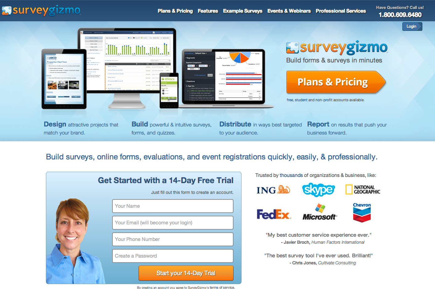
Web visitors perceived us as conventional and were caught off guard by our informal playful tone when they contacted us or received an email from our Survey Mermaid, Survey Gunslinger, Survey Princess, Survey Jedi and the likes.
We needed a website that reflected our personality and values.
Website Design Strategy #3: Buyer and Design Persona
You are probably familiar with buyer personas. This is a character that represents your target audience. It takes into consideration the user’s goals, desires, and limitations that guide purchasing decisions.
Similarly, a website should have a design persona that represents your brand. It should mirror how you want others to see you. Our old corporate persona did not represent us. It was formal and lacked emotion.
An appealing website that evokes emotion makes a lasting impression. It will stand out among the competition and be remembered when it is time for your web visitors to make a purchase.
In his book Emotional Design, Don Norman describes the importance of creating an emotional experience and why “attractive things work better.”
User experience designer Aarron Walter describes in his book: Designing for Emotion how emotional experiences make a profound imprint on our long-term memory and creates “an experience for users that makes them feel like there’s a person, not a machine, at the other end of the connection”.
A personal connection is essential if you want people to commit to you.
As Sabina Idler sums it up in her article: Building Emotion Into Your Website
“Emotions give us positive experiences, making us happier and giving us better recall.”
With this in mind, we focused these three areas to define web persona:
Traits:
What makes our brand personality unique? We created a list of traits that best described our brand. Friendly and humorous fit us better than sophisticated and formal.
Voice:
The tone of voice should reflect our personality traits. Since our brand is light and humorous, we needed to use a less formal tone and a bit of wit in our copy and messages.
Visual:
What character or image embodies our personality traits? We did not want this character to be a mascot but knew that a visual representation would personalize our brand so our audience could relate better to it.
Website Design Strategy #4: Analyze Competition
Understanding what the competition is doing can help you finalize your redesign plan. Look at what is and isn’t working as far as making emotional connections and search engine rankings.
With a clear redesign strategy, we were ready to move on to the next phase and develop a design plan.
Website Design Plan
We recognized that that our old website spoke in stuffy corporate tones that was lacking in personality and emotion. We decided to rebrand with:
- A modernized logo
- Colors that were bright and cheerful
- Imagery that was fun and invited our visitors relax and explore the possibilities
- Typography that was modern and friendly
- Landing page layout that was easy to navigate and inspired people to learn more about collecting data that they could act on
- Copy that matched our casual voice that spoke about exploring questions and discovering answers
- Pages that were responsive and mobile friendly
- Call-to-action that increased signups for our 14 day free trial
A mood board (also known in some fields as an inspiration board) is extremely useful for establishing the aesthetic feel of a web site. It usually fits into the design process somewhere between the wireframes and design mockups.
A mood board explores photography style, color palettes, typography, patterns, and the overall look and feel of the site.
We used an outside web design agency, Slice of Lime, to help us with this process. We had several meeting sessions that focused on our personality, user persona, goals, and mission statement before they presented color palettes and visual illustrations.
They then watched our emotional reaction to the illustrations. It didn’t take long for us to choose which visual image best represented our unique qualities and brand message.
These little bots best reflected our brand personality. They were whimsical and worked well with our theme of explore and discover.

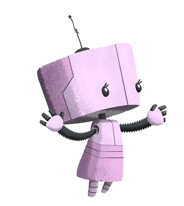
Having seen the illustrations, we were excited to move on to the design phase.
Implementing Website Design
The design phase mainly consisted of building wireframes for our main pages and writing content.
Imagery
Recognizing that many of our users are stressed because they have just been assigned a new project with a tight deadline, we wanted imagery that was fun and soothing. With this in mind and our desire to expand on our explore and discover theme, we chose this illustration for our home page:
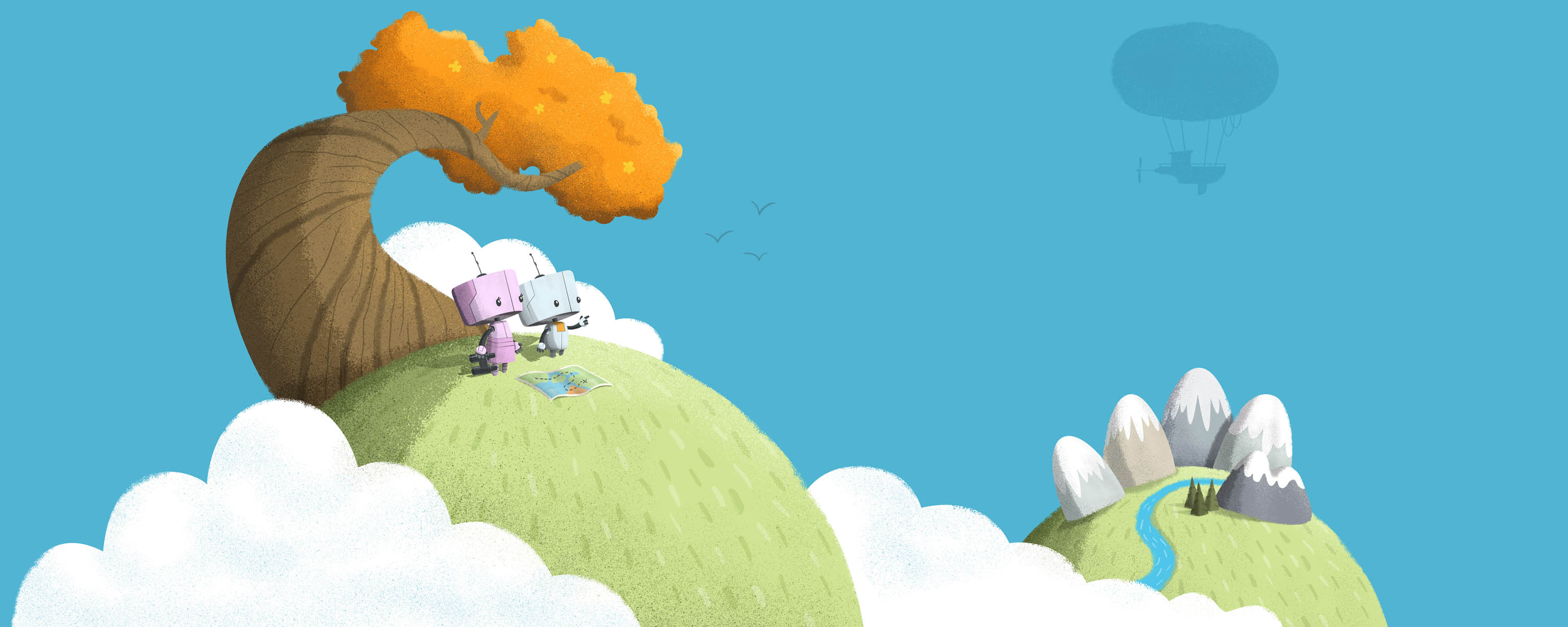
The bots looking beyond conveyed a sense of wonder. Small details such as the map and binoculars, added to the exploration theme. The sky and clouds and airship represented the endless possibilities.
Web Content
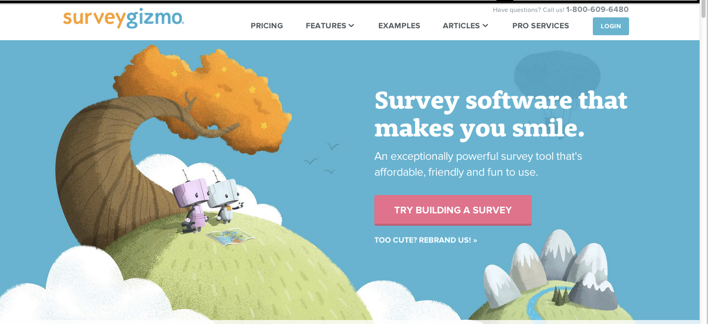
Our marketing team collectively worked on the content that expressed our unique value proposition. Because we strive to make our customers happy by providing an easy and affordable solution, we came up with this head and byline:
Survey software that makes you smile.
An exceptionally powerful survey tool that’s affordable, friendly and fun to use.
CTA
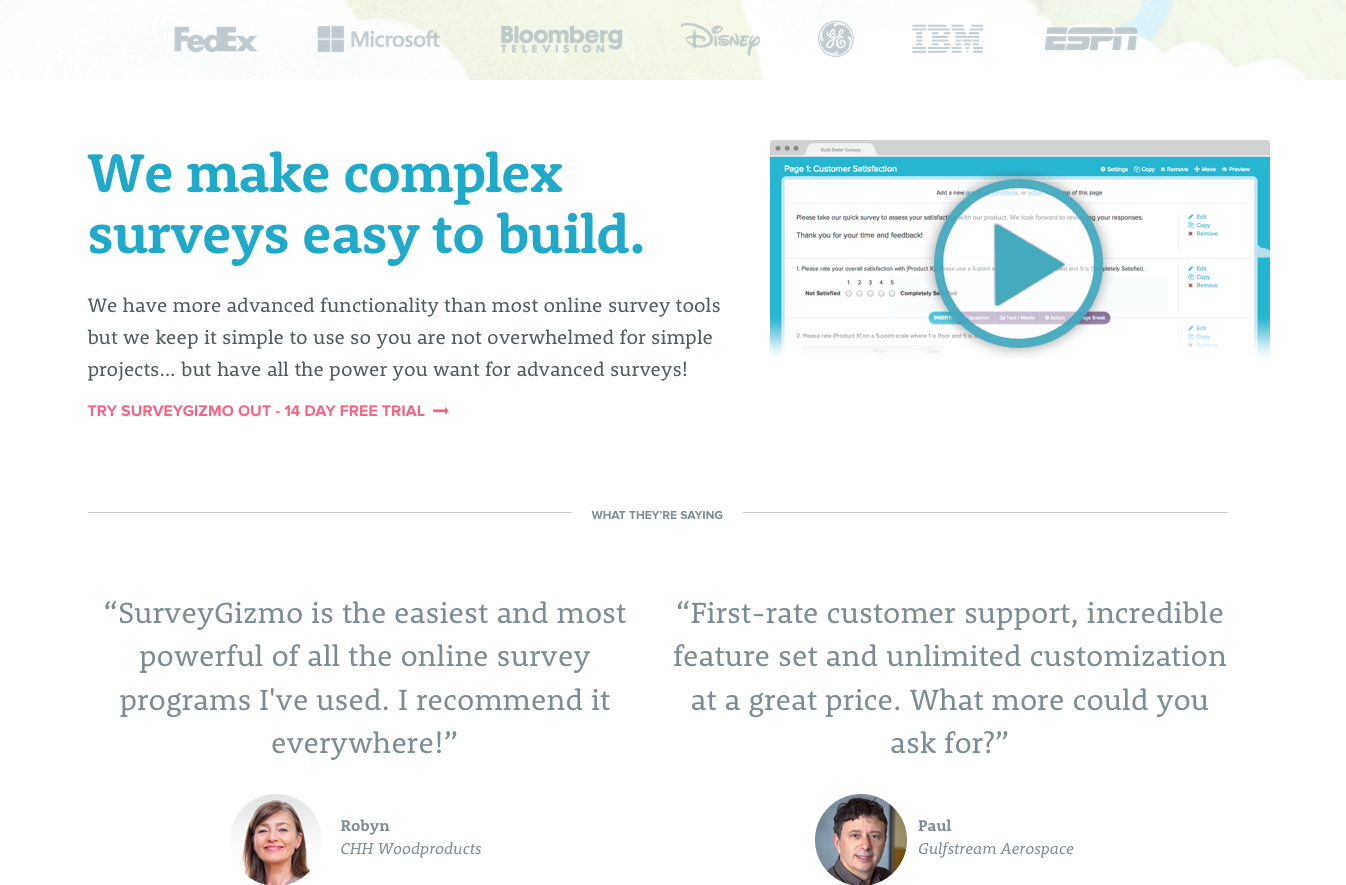
Next we needed simple navigation and a prominent CTA that encouraged users to give us a try. We used a unique color so that it stood out. We also added social proof and testimonials to build trust.
This is the final result:
The Results of Enhanced Website Design
The result has been a 7% increase in new users and a 31% increase in trial signup. We have also seen a 25% increase in mobile traffic. Needless to say, we are quite pleased with the results and we continue to receive positive feedback.
But there are still improvements we need to make. These include:
- Decrease page load time
- Decrease bounce rate
- Increase page depth
- Increase time on site
As any experienced marketer and webmasters know, optimization is an ongoing process, so this comes as no surprise. You can bet that you will see more changes on our site in the near future.
I will leave you with one final take away and that is a list of checks to optimize your website.
Post Website Design Optimization
- Make sure the new site is multi-browser compatible.
- Make sure all old pages redirect to appropriate new pages.
- Make sure you have custom/user-friendly 404 pages.
- Run your site through a broken link checker.
- Set up and add sitemap.xml and robots.txt files.
- Make sure users can easily subscribe to blog, email, etc.
- Make sure users can easily share pages, posts, photos, etc.
- Get your analytics tool(s) up and running on your site.
- Optimize for search engines by checking for keywords in meta title and description and alt-tags as well as your H1 and H2 tags.
Please share your website redesign tips here!
Resources:
Smashing Magazine – Building Emotion Into Your Website
Emotional Design, Don Norman
Designing for Emotion, Aarron Walter