After you’ve run a successful survey project and have gathered your amazing survey data, it can be tempting to race through creating charts and graphs.
The excitement of having survey data to share can drive us to visualize our data in ways that don’t do the project justice; we need to slow down and make each graph count.
The goal is graphical excellence, which we define as communicating ideas as clearly, precisely and efficiently as possible while letting the survey data reveal the truth. When you’re deciding how to present your survey results, remember that just like your survey wasn’t a test for the respondent, “report charts are not a test for the reader.” 1
These handy tips will help you keep your graphs true to the data.
Tips for Maintaining Graphical Integrity while Visualizing Survey Data
While there will sometimes be clients or companies who want us to manipulate survey data, most of the breakdowns in graphical integrity are accidental. Mistakes happen, but keeping an eye on these best practices for your survey results will keep your charts on track.
Be Clear About Survey Data Totals
One very easy way to be totally clear about your survey data is to include the number (N) of total observations on your chart. This simple addition is critical to understanding the data presented.
Including the number of observations on your chart lets the reader reconstruct your data from the percentages given. It also provides an indirect measure of the variability one might expect to see within your results.
If the total number of observations is small, typically fewer than ten or fifteen, use number counts instead of percentages. When you have a very small number of survey respondents it is better to plot counts than the percentage of counts.
Even though it is possible for the reader to calculate the counts on his or her own, going to counts for small numbers helps the readability of a chart by eliminating the extra step. The human brain can read and interpret small numbers quickly and without ambiguity.
Don’t Overload Your Chart or Graph with Survey Data
It is important that your reader be able to get information quickly and efficiently from your chart or graph. You don’t want them to stare hopelessly at your data trying to find their way around.
There is often a tendency to add too many items to your graph that do not add to the data’s message. Often “non-data” items are included that can detract from or mask the true information.
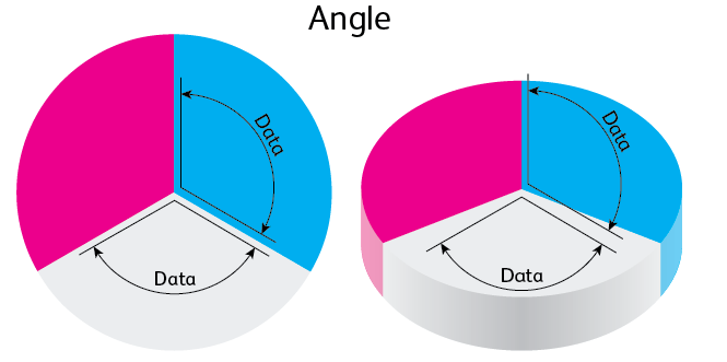
This is particularly true when it comes to fancy 3-D graphs.
Visual.ly offers a very clear example of the problems that perspective and parallax cause with their shifts in angles:

As we’ll see in the following sections, even if you include only data on the chart, it is easy to overload it with information. An overcrowded presentation puts important data at risk of being ignored or overlooked.
Drew Skau argues that an, “overstuffed chart makes it easy to miss certain parts of the data, and the details disappear. Keep the amount of data in your charts to reasonable quantities.”
Choose Your Survey Data Chart Types Wisely
If 3-D graphs aren’t a possibility, what types of survey data visualization can we use for our survey results? Stick with this short list and you’ll be much more likely to show your data in a clear, concise way:
- Pie charts
- Bar charts and column charts
- Stacked bar and stacked column charts
- Scatter plots
Show All Your Survey Data
The complete truth about a data set usually extends beyond what you can fit on a single chart or graph, but you need to strive to show all available data.
For example, suppose a manufacturer comes out with a new product release and wants to see what effect the new release has had on service calls. They might create a chart that shows the number of product service calls for the year before the release compared to the same number after the new release.
This seems like a reasonable approach, but the two years of survey data do not begin to tell the whole story. They need a lot more historical data to get an accurate picture.
Avoid Cropped Axes in Survey Data Visualizations
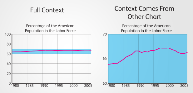
Showing all of your available survey data better represents the true situation, and this goes for the axes on your charts as well. The two charts below give substantially different pictures, even though they’re about the same data:

Having complete information and then drilling down to show a closer look at fluctuations within that big picture can still achieve your goals without distorting how you show results.
Designing Your Survey Data for Success
When setting up your charts and graphs, make sure you’re considering not only the accuracy of your presentation also its visual appeal. You should make smart color choices, create a clear visual hierarchy, and choose consistent chart types and scales.
Colored charts are certainly compelling, but keep in mind how the colors may be altered if your data is printed rather than shown digitally. Dr. Frederick C. Van Bennekom also encourages us in Customer Surveying to, “Be consistent in how you use colors or patterns. This will avoid confusion as the reader progresses through the report.”
Consistency is also key when choosing chart types and the scales of your axes, according to Van Bennekom:
Use the same type of chart throughout the report to show a specific type of information. For example, use scatter plots for trends and pie charts for demographic statistics…When plotting data from interval questions, it is best to show the entire scale…If you do truncate the scale, always truncate in the same fashion, using a footnote to inform the reader.
Remember, you don’t want your data to be a test of reader comprehension. Instead you want connections and patterns in your survey results to be clear and apparent to your audience.
Use Graphical Power Wisely and Well while Visualizing Survey Data
As I’ve talked about many times, graphical displays of data can be powerful communication tools.
If you follow these few tips it should help you provide clear and concise information and avoid charts that are confusing or misleading to your readers.
Sources:
1. Customer Surveying by Dr. Frederick C. Van Bennekom